INFLUENZA PAMPHLET
GETTING STARTED
I have always been a fan of the Victorian era of design (1837-1901). Through the evolution of design, the style balances ornate beauty and purposeful storytelling. The intricate linework, dramatic typography, and rich symbolism feel handcrafted and intentional, like every detail was meant to captivate the viewer and communicate status, mystery, or spectacle. There’s a theatrical quality to it—bold headlines, decorative borders, and illustrative flourishes that command attention in a way modern designs often doesn’t.
Creating a project with this style feels nostalgic without being stale, expressive without being chaotic, and it mirrors my love for fantasy and dramatic world-building, making each piece feel like a window into another time rather than just a flat graphic.
THE DESIGN
Outside Panels
Inside Panels
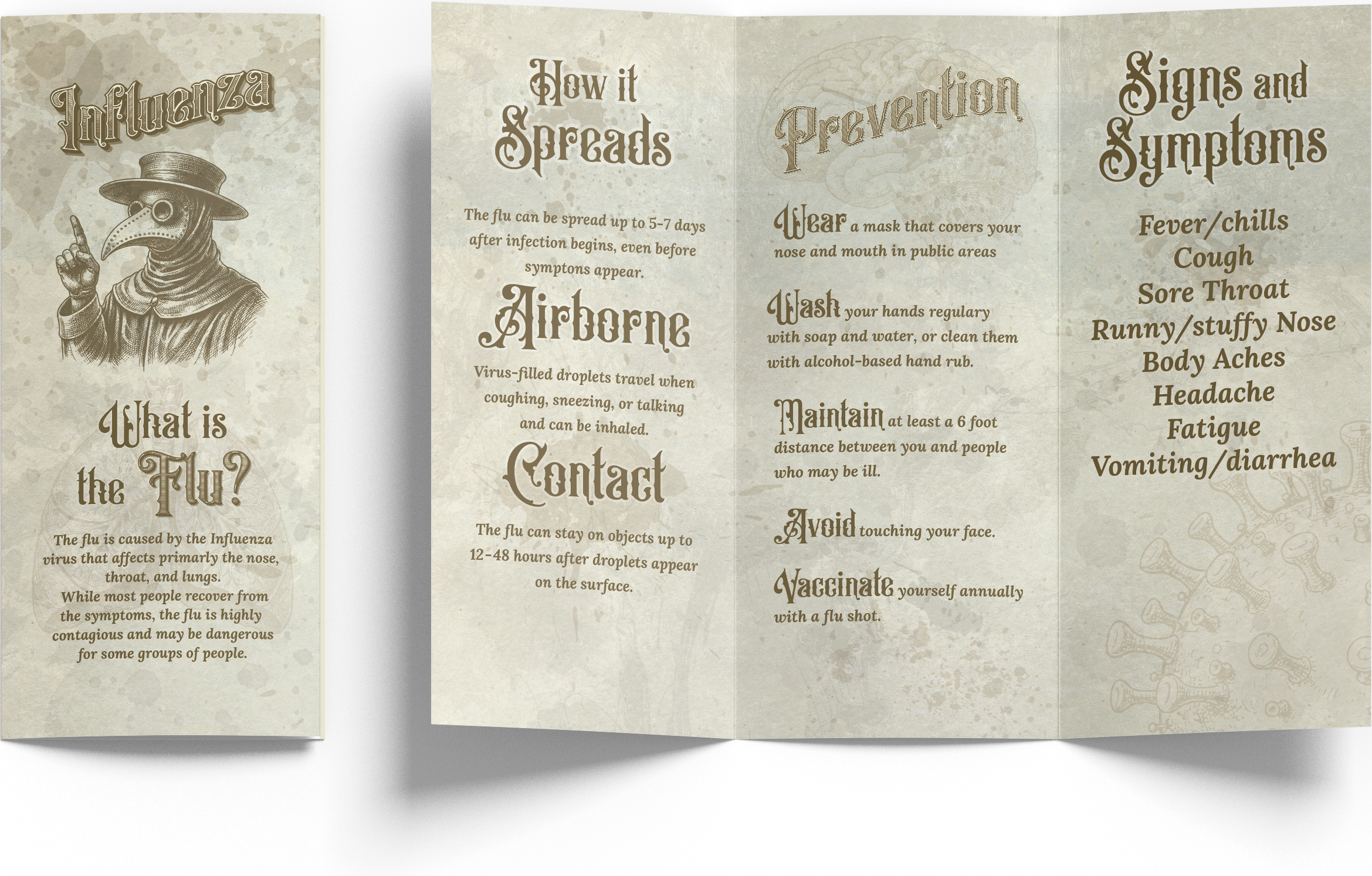
For this pamphlet, I started by grounding the concept in authentic Victorian-era print aesthetics—ornate blackletter-inspired headings, decorative serifs, and a muted sepia color palette to instantly signal “historical.” I chose a parchment-like background texture with subtle stains and wear to mimic aged paper, helping the piece feel archival rather than digital. The layout follows a traditional broadsheet structure: clear column divisions, strong hierarchy through oversized headers, and generous spacing so the dense information remains readable despite the ornamental type.
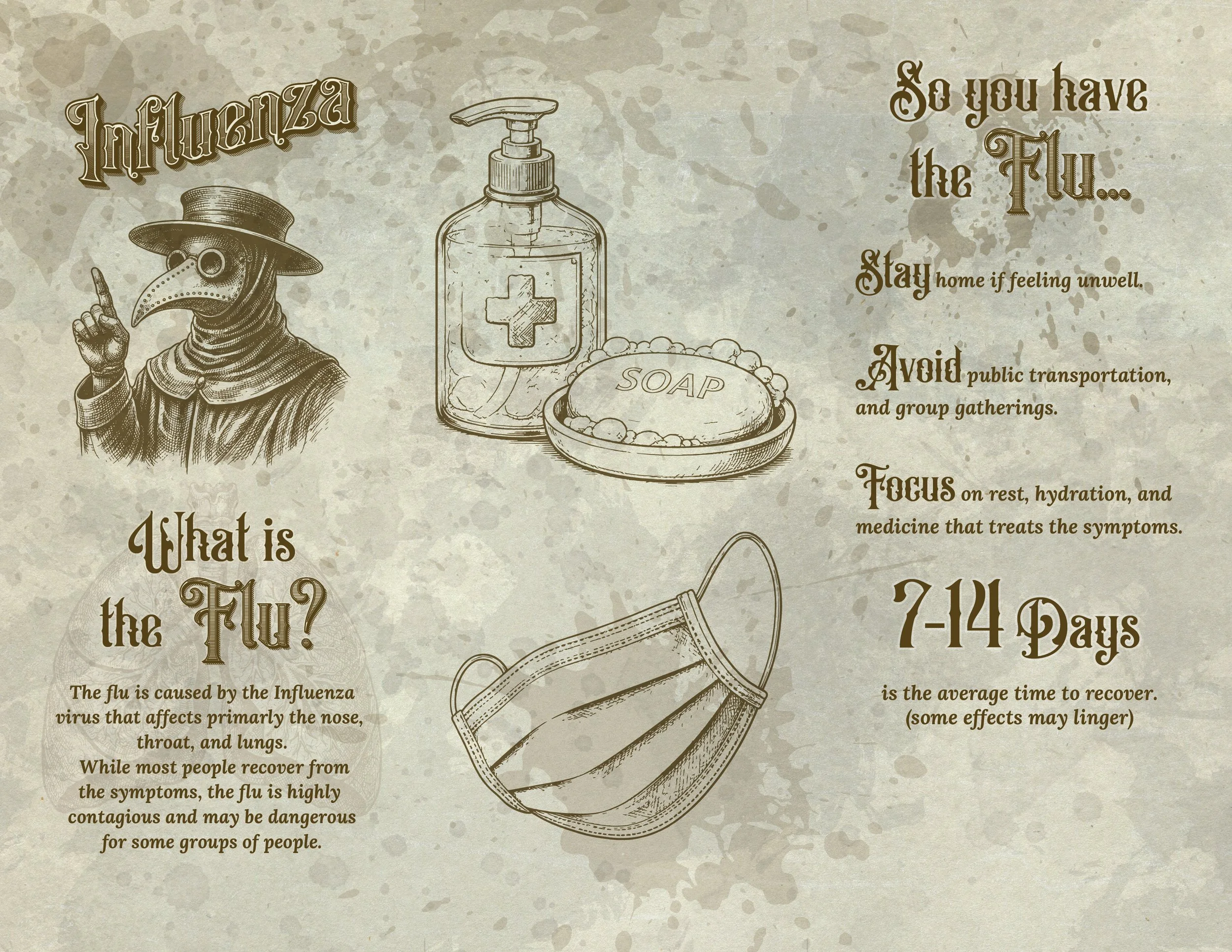
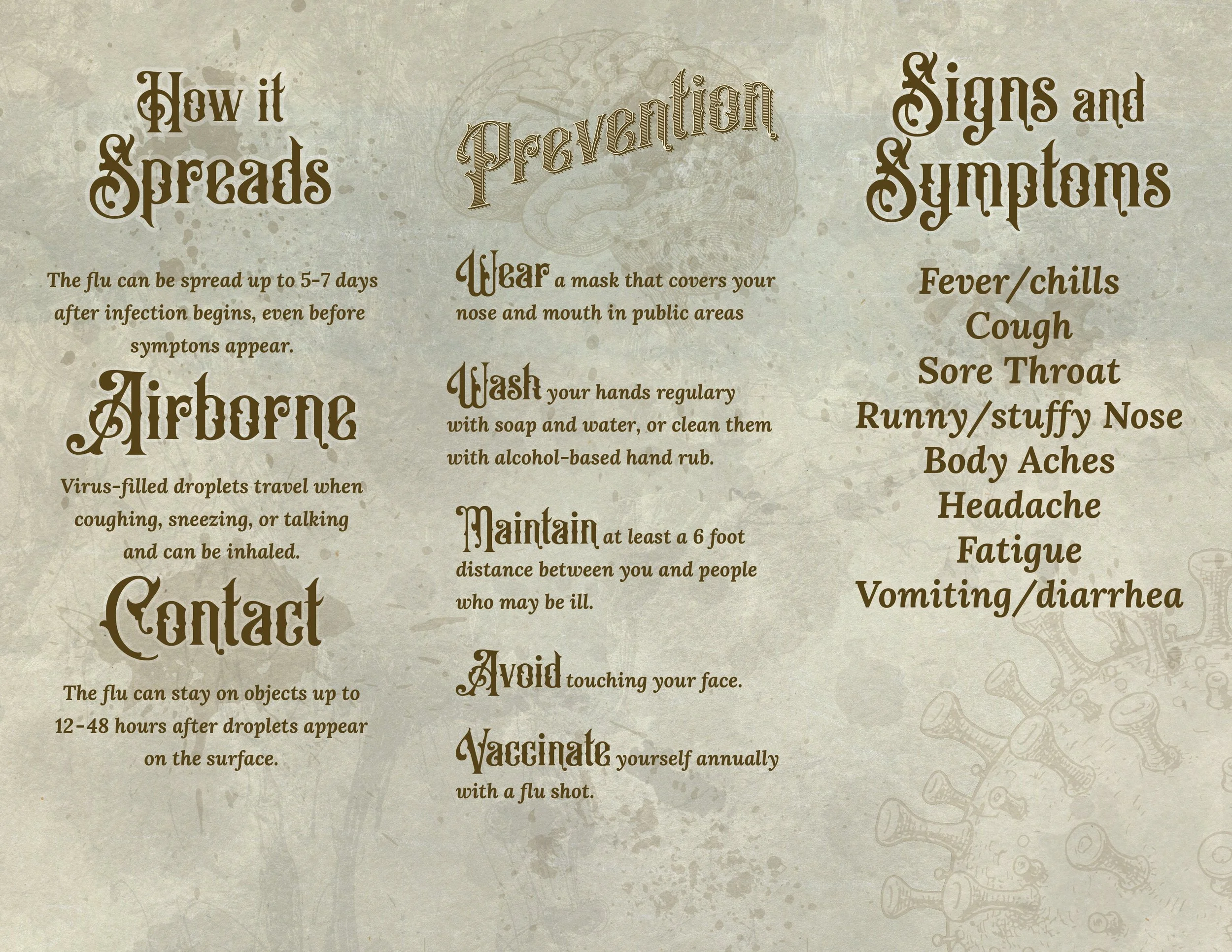
Next, I incorporated period-inspired illustrations such as a plague doctor, a brain, soap, mask, and virus imagery—to echo 19th-century medical diagrams and pamphlets. These visuals aren’t just decorative; they reinforce the content thematically while maintaining stylistic consistency. I kept everything monochromatic and slightly distressed so nothing felt out of place or distracting from the informational text.
Finally, I balanced style with function. Even though the design leans heavily into historical flair, I made sure the information hierarchy stays clear: bold section titles, concise bullet-style lists, and logical content grouping. The result is a piece that feels theatrical and atmospheric while still serving its purpose as an educational pamphlet—blending aesthetic storytelling with practical communication.
IMAGES AND A.I.
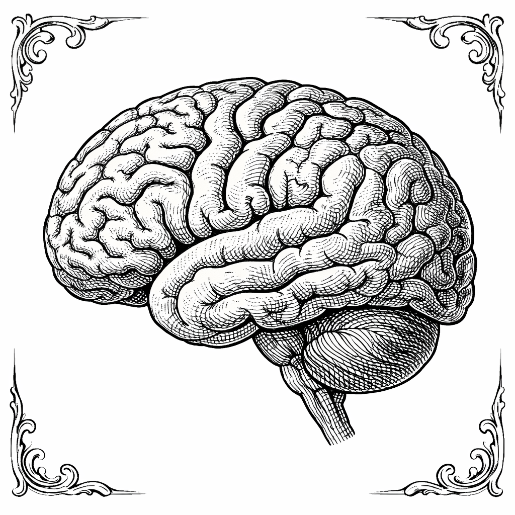
Brain

Plague Doctor
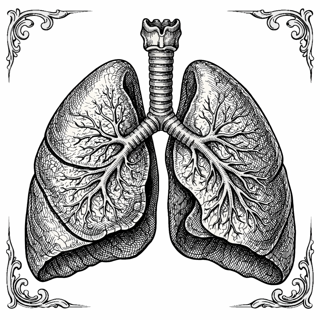
Lungs
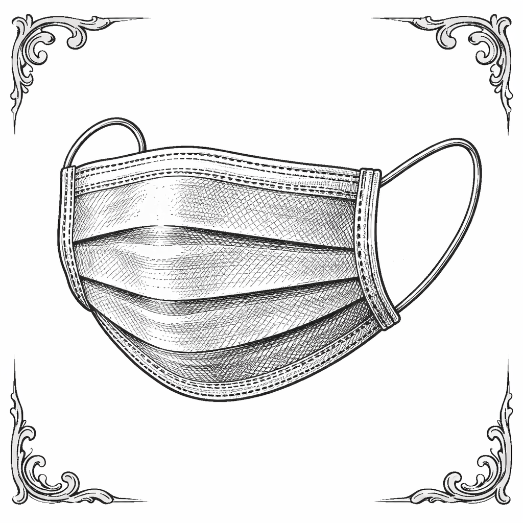
Mask
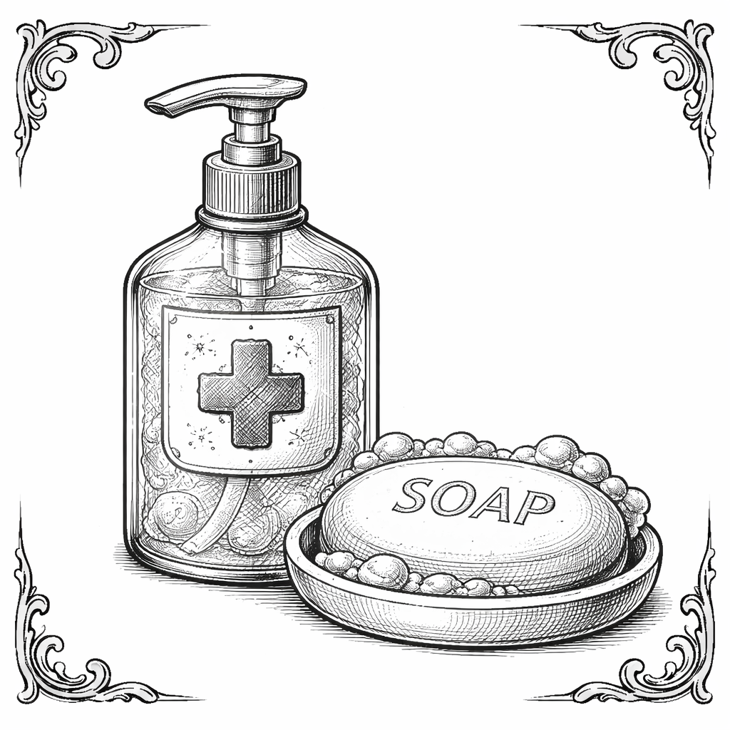
Soap and Disinfectant

Flu virus
By crafting detailed prompts that referenced 19th-century medical engravings, antique etching techniques, and monochrome ink styles, I was able to generate visuals like the plague doctor, anatomical sketches, and hygiene objects with an authentic period feel. I iterated through multiple variations, refining prompts to control the line weight, shading, and composition until each image looked cohesive and ready to use. This allowed me to build a consistent visual library without relying on stock imagery or using too much time and resources to create unsatisfactory images
Once the base assets were generated, I refined and edited them to fit the layout and narrative of the pamphlet. I adjusted the contrast, added subtle distressing, and unified their colors so everything felt like it belonged on aged parchment. AI became a creative collaborator rather than a shortcut - helping me explore visual paths maintaining creative control over selection, placement, and final presentation.
FONTS
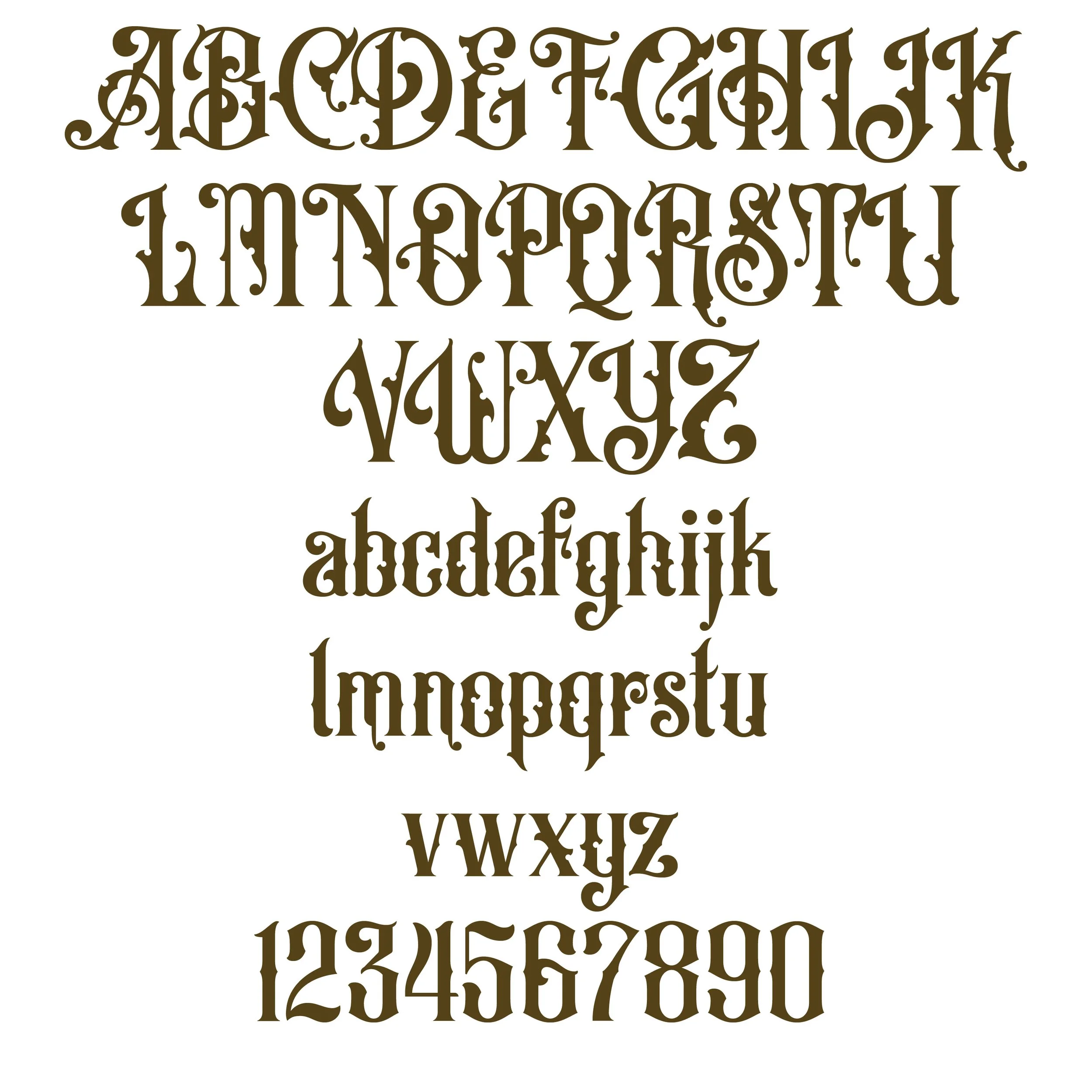
Old Alfie font
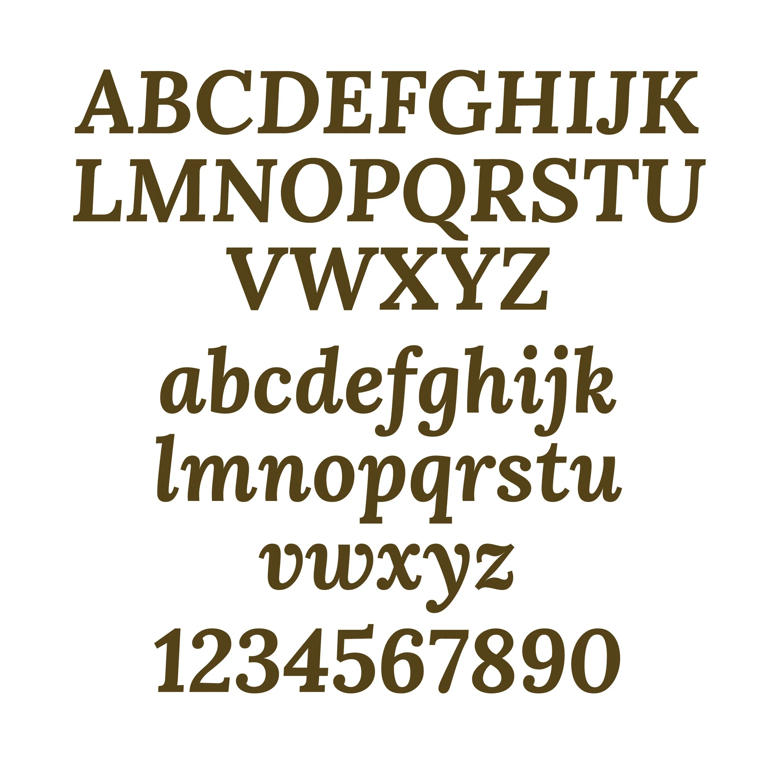
Lora font
I chose Old Alfie for the titles as the font captures the dramatic, ornamental spirit of Victorian print design. Its exaggerated serifs, sharp angles, and decorative flourishes sets the tone, making each headline feel theatrical and period-authentic. The font commands attention and gives the pamphlet a strong visual hierarchy, ensuring section headers stand out while reinforcing the historical theme. Old Alfie also mirrors the kind of expressive type you’d see on old broadsheets, circus posters, or medical warnings from the era, which helps sell the immersive, time-worn aesthetic.
For the body copy, I selected Lora to balance readability with elegance. While it still feels classic and literary, Lora is much more restrained, making it perfect for longer informational text. Its smooth curves and open letterforms keep the content approachable and easy to scan, which is crucial for quick information. Pairing Lora with Old Alfie creates a strong contrast, allowing the design to feel rich and stylized without sacrificing clarity or accessibility.